PROJECT: Libla Family Sports Complex
MARKET SECTOR: Institutional
PARTNER: Dille Traxel
PROJECT SCOPE: Concept Development, Schematic Design, Budgeting Assistance.
LOCATION: Poplar Bluff, MO
SIZE: 51,000 SF
COMPLETION: 2018
Lobby Design
The Lobby is the visitors first impression of the Raiders. The extensive volume of space is captured and brought down to a more human friendly scale by an exaggerated basketball net that is installed to match the angle of the wall color. These angles bring the visitors attention down to the entrance of the arena. The net opens up to a sleek, circular light fixture and lively super graphics that introduce the Home of the Raiders. The 3R Logo is projected onto the floor below the light fixture for visitors to walk though and engage with as they enter the space.
Elevations
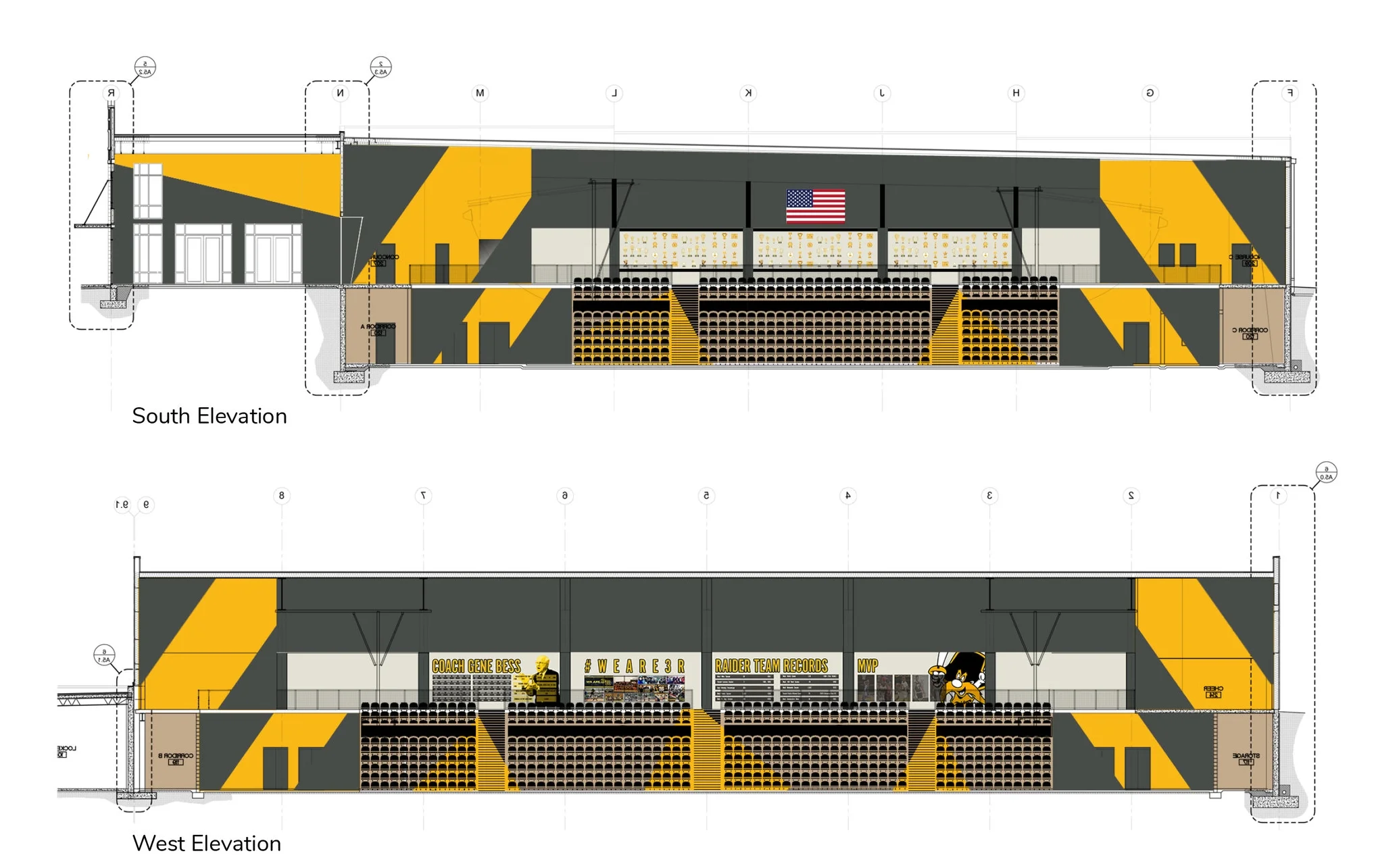
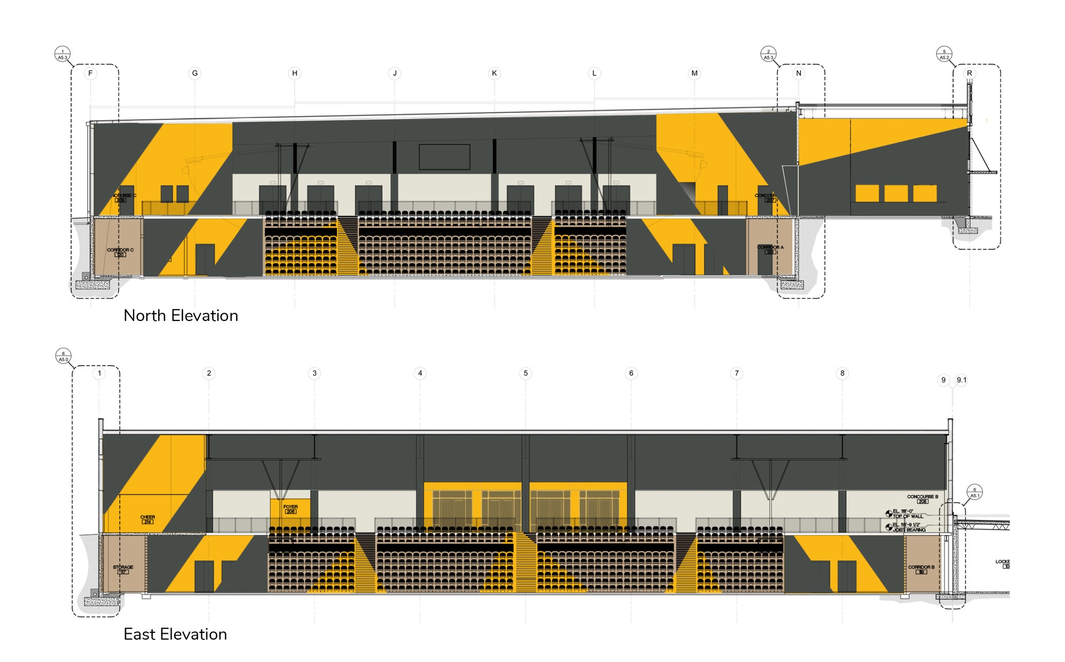
The paint is applied in dynamic angles throughout the space to create interest and excitement. The unique application of paint color engages the audience and enhances their senses, elevating the experience. The angled pattern in each corner creates a lighting bolt effect as it transfers from the 200 level to the 100 level in elevation and proximity to the court.
Finish Floor Plan
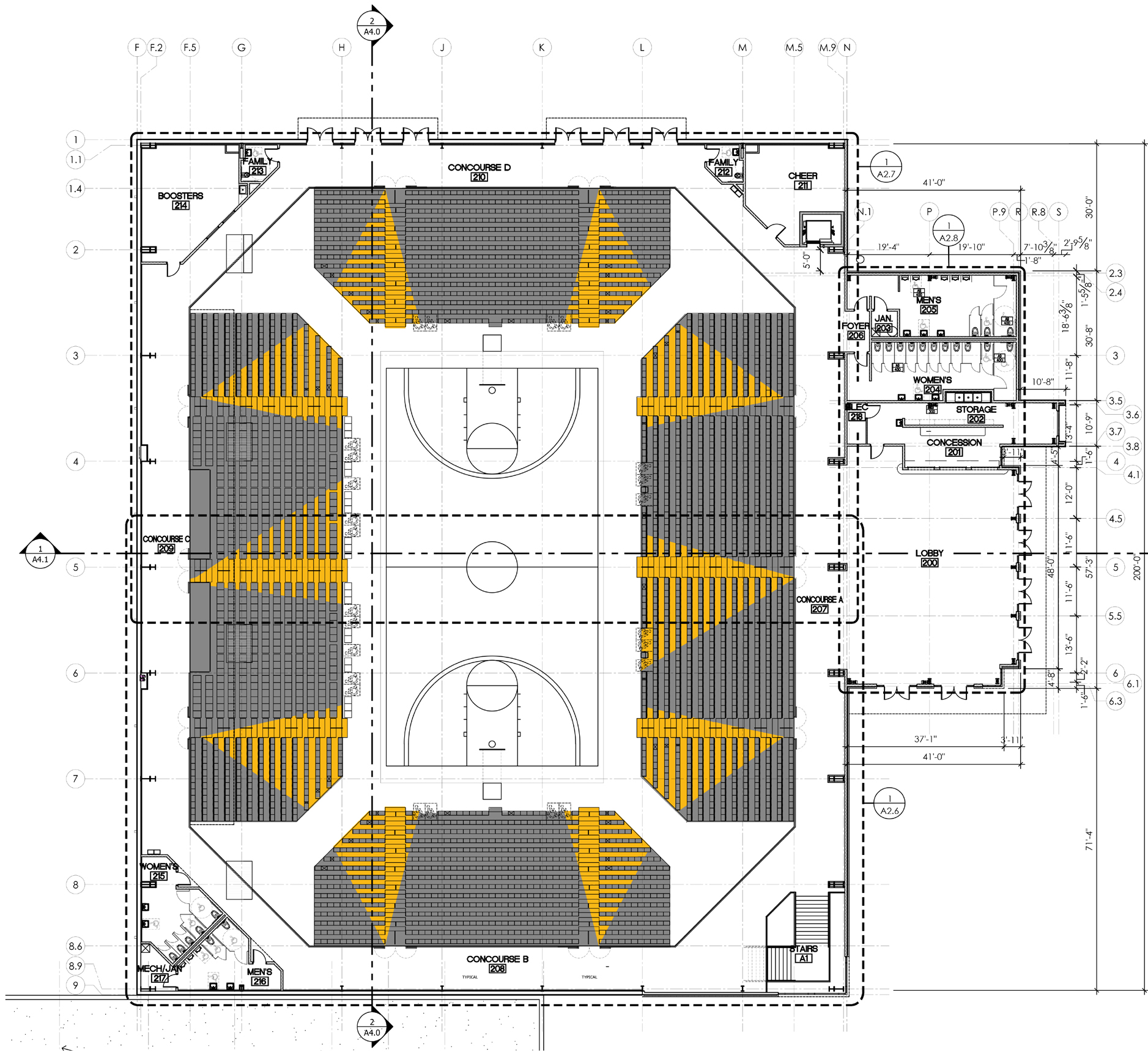
The finish floor plan incorporates the same dynamic angles of yellow color throughout the stadium seating and bleachers. The yellow color-ways lead your eyes from the walkways down the court and also direct your attention to the top of the walk ways when exiting your seats. The yellow flooring would be an adhesive vinyl decal material.
Elevator Surround
The elevator surround highlights the elevator with bold acrylic graphic wall panels. The graphic would be made up of three panels that engage the user to the vertical transfer. The panels have both stand-off and locking cleat hardware options.


